My take on what the flags should be for each of the United States and U.S. territories, as well as for the country.
United States of America
 |
| Current |
 |
| Proposed: redesign on r/vexillology, 2014 |
The current design is rather busy (especially the blue field of stars), and it has a unique problem of requiring an update every time a new state is added. The proposed design mitigates these problems while keeping recognition.
Alabama
 |
| Current |
 |
| Proposed: Redesign by Redditor u/adamolis69, 2022 |
The current design has
contested roots with symbols of the Confederacy. As stated by the original creator of the redesign, it draws on symbolic elements such as the
state bird (yellowhammer) and
nickname (Cotton State).
Alaska
 |
| Current |
Arizona
 |
| Current |
 |
| Proposed: minor edits |
The proposed design alters the shading of the bronze star to increase contrast with the background.
Arkansas
 |
| Current |
.svg.png) |
| Proposed: historical design, 1912 |
The proposed design is the original design proposed by
Willie K. Hocker in 1912, before the request of the flag committee of the Pine Bluff Chapter of the Daughters of the American Revolution to add the word "Arkansas". It also notably does not include the
later-added fourth star added by the state legislature in 1924 to represent the Confederate States, and it thus preserves the deep
symbolism of the original three stars.
California
 |
| Current |
 |
| Proposed A: minor edits |
Proposed design A removes the wording from the current design and repositions the bear to fill the created blank space. As stated by the original creator of proposed design B, "to explore flag design best practices, we removed the words 'California Republic', simplified the bear to a geometric design, and simplified the colors to just red and white."
Colorado
 |
| Current |
Connecticut
 |
| Current |
 |
| Proposed: redesign by Redditor u/Zpunky_, 2023 |
As stated by the original creator of the design below, "the green stripe represents our abundant forests and nature, the five stars within representing Connecticut being the fifth state of the union. The blue stripe represents our rivers and Long Island Sound. The white stripe, yellow pin stripes, and grapes together are evocative of our coat of arms on the current flag. Individually, the white stripe represents purity, the yellow stripes our joy and marshes, and the grape bunches the original three settlements of our state."
Delaware
 |
| Current |
 |
| Proposed: substantial edits |
The proposed design retains the unique buff-and-colonial-blue color palette of the current design. The wording is removed, and the coat of arms is replaced by a white star, which symbolizes Delaware being the first state to
ratify the Constitution of the United States.
Florida
 |
| Current |
 |
| Proposed: redesign on subreddit r/vexillology, 2023 |
As stated by the original creator of the proposed design: "The
Cross of Burgundy is because Florida was founded as a Spanish colony. The orange was because of the seal, and also Florida has a big industry for growing oranges. Also, the flag looks kind of like sunshine, with the red and orange coming from the center."
Georgia
 |
| Current |
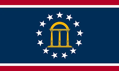 |
| Proposed: redesign by Redditor u/motx72, 2021 |
The current design is
based on the First National Flag of the Confederacy, also known as the "
Stars and Bars", which is problematic. The proposed design is based on the canton of the current design. As stated by the original creator of the proposed design, "the arch symbolizes the state's constitution and the pillars represent the three branches of government: Legislative, Executive, and Judicial. The pillars embody the words of the state motto,
Wisdom, Justice, and Moderation, dating back to the American Revolution. The red & white stripes, and the blue field with the 13 stars allude to the stars & stripes of the
USA flag. The state of Georgia was one of the original 13 colonies (states) of the United States of America."
Hawaii
 |
| Current |
 |
| Proposed B: redesign by Redditor u/HSudev521, 2021 |
The current design features a
Union Jack canton, which commemorates the pro-British sentiment of Hawaii's founder and first ruler,
King Kamehameha I. It bears striking resemblance to the imperialistic
flag of the East India Company. The colors also may reflect the symbols of the foreign powers that first visited Hawaii: the
United States,
United Kingdom,
Russia, and
France.
Proposed design A, known as
Kānaka Maoli flag ('true people' in the Hawaiian language), is purported by some to be the original flag of the
Kingdom of Hawaiʻi, though this claim is unverified and widely disputed. It was introduced to the public by Gene Simeona in 2001. It has nine alternating stripes of green, red, and yellow defaced with a green shield with a puela (strip of kapa bark cloth insignia flown atop the double hulled canoe of the chief) crossed by two paddles. Despite the lack of verification about its historic use, the design has gained popularity among people who prefer its lack of apparent colonial imagery.
As stated by the original creator of proposed design B: "The field of the flag is composed of eight horizontal stripes, symbolizing the eight major islands (Hawaiʻi, Maui, Kahoʻolawe, Lānaʻi, Molokaʻi, Oʻahu, Kauaʻi, and Niʻihau). The colors alternate between red, blue and white symbolizing the courageous heritage, connection to water and the ocean, and commitment to peace respectively. Together, they also are the American colors denoting the status of the State within the Union. At the flag’s center is a circular green shield representing environment and the Circle of Life; bearing a native Kānaka Maoli kahili, the original Hawaiian royal standard taken from the banner of the the Kamehamehas, defacing two crossed pointed paddles, meant to represent the voyaging tradition of the Native Hawaiians. The ensign is gold to denote prosperity and commerce"
Idaho
 |
| Current |
 |
| Proposed: redesign by Redditor u/NxMaGiiCz, 2021 |
As stated by the original creator of the proposed design, the colors bear the following symbolism: white for the
state flower and the snowy mountains of the state, red to reference the
flag of the Nez Percé tribe, blue for the rivers and waterways of the state and the
state bird, and gold for the sun and richness of the land. The white chevron represents the
Rocky Mountain range, and yellow lozenge represents the
state nickname of
The Gem State and the resources of the state, including
potatoes.
Illinois
 |
| Current |
To celebrate Illinois's first 100 years of statehood,
Wallace Rice (who designed the
flag of Chicago) designed a centennial flag for the state in 1918. The ten blue stars in each of the upper and lower white band represent the ten Northern and ten Southern states at the time of Illinois' statehood in 1818. The large, white star presents the state of Illinois itself.
Indiana
 |
| Current |
The proposed design is the original design proposed by Paul Hadley in 1917, before the Indiana General Assembly added the word "Indiana".
Iowa
 |
| Current |
 |
| Proposed: redesign by Redditor u/__-__-___---_-_-_--, 2021 |
As stated by the original creator of the proposed design, "the flag is based off of the current flag for Iowa, which has the same eagle... This flag uses a layout of gold and light blue instead, representing the golden prosperous fields and clear blue skies of the state. The light blue is exactly opposite on the color cube to the brown used in the eagle, representing the growing diversity of the state. The eagle continues to be a representation of the greater whole of the nation and its ideals."
Kansas
 |
| Current |
 |
| Proposed: redesign by Redditor u/psychicpebble, 2023 |
As stated by the original creator of the proposed design, it is "more akin to a redesign of the old
state banner.... The star in the center of the sunflower serves as a reference to the state motto of
Ad astra per aspera:
To the stars through difficulties... The middle of the flag forms the letter 'K'. The pointed lines on the right represent the mountains in the seal on the current flag. The straight lines on the left represent the flat terrain of Kansas. The sunflower in the middle is the state flower. The white star in the middle represents prosperity."
Kentucky
 |
| Current |
 |
| Proposed: redesign by Redditor u/vexed-perplexed, 2025 |
As stated by the original creator of the proposed design, it "features a 3:6 tilted checkerboard pattern (lozengy) of navy blue and gold with a 2:2 white, navy, and gold, eight-pointed 'LeMoyne' or 'Appalachian' quilt star in the canton. The alternating diamond pattern is inspired by both Kentucky's rich history of quilting and the patterns often seen on the racing silks worn by the state's derby jockeys. In total, there are fifteen gold diamonds, representing Kentucky's admission into the Union as the fifteenth state."
Louisiana
 |
| Current |
 |
| Proposed: redesign by Redditor u/scottishdoge, 2023 |
As stated by the original creator of the proposed design: "The navy represents Louisiana's large coastline. The purple, green, and yellow are Marti Gras colors that represent Louisiana. The Fleur-de-lis represents Louisiana's French heritage and how it’s still big part of the states identity today. The top of the Fleur-de-lis is designed to look like a Pelican head, as the pelican is the state bird."
Maine
 |
| Current |
 |
| Proposed B: redesign: contest winner on US State Flags page on Facebook. |
In November 2026, the state is planning to hold a referendum on whether to restore proposed design A or keep the current design. Proposed design B was the contest winner on US State Flags page on Facebook. According to the prolific vexillologist u/RottenAli, this design "features 23 vertices that equate to the admission number of the state into the union. Also a balance stripe of Atlantic blue in the fly. (Maine has a very long coastline despite it's land area. That proportion buff to blue uses a buff area of ratio 26:33 and thus ties to the current flag better.)"
Maryland
 |
| Current |
Massachusetts
 |
| Current |
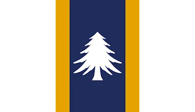 |
| Proposed: redesign by Redditor u/Smiix, 2021 |
A statement by the original creator of the proposed design: "I wanted the redesign to have similarities to the current design. Like being mostly white and also using blue and gold. Then I looked at the historical flags of the state, and found that the pine tree is a symbol heavily associated with the area, so I wanted to use that as well."
Michigan
 |
| Current |
 |
| Proposed: redesign by Redditor u/Rich-Entry3636, 2023 |
As stated by the original creator of the proposed design: "The blue cross is for the four Great Lakes that the state borders and the state’s French heritage, the green outline is for the land and green forests, the white field is for the snow and hope for peace."
Minnesota
 |
| Current |
 |
| Proposed: historical design F1953 |
Designated F1953, the proposed design was submitted to the
Minnesota State Emblems Redesign Commission by Andrew Prekker.
On December 15, 2023 the committee decided that the final flag would be a variant of F1953, removing the stripes and altering the star's shape.
Mississippi
 |
| Current |
 |
| Proposed: minor edits |
The design below has one fewer stars (20) than the current design (21). This is because the topmost, gold star (composed of a pattern of five diamonds, an Indigenous symbol) represents Mississippi, and the 19 white stars represent the other states at the time of admission into the Union. The design below also removes the wording from the current design.
Missouri
 |
| Current |
 |
| Proposed: redesign by Redditor u/TobyeatsfAtcoW, 2023 |
As stated by the original creator of the proposed design, this design "keeps the spirit and a major design element of the current flag, the inspiration from the French flag as a base. Due to the state's origin, with its first major settlements coming primarily from French colonists (St. Louis, etc.), the current flag uses the French tricolor as a base. I kept the exact colors from the old flag, as well as the orientation, but removed the state seal and replaced it with a thinner blue stripe that expands out at the right edge, along with the white stripe. Within the stripe are six four-pointed stars, representing Missouri's entrance to the union as the 24th state. The rightmost star is enlarged to highlight both the state's largest city, St. Louis, and the confluence of the Missouri and Mississippi rivers. The third star of the remaining five has a golden color to represent the capitol, Jefferson City, which is located in the middle of the state, and as a reference to the state's central location in the nation, living in the heart of the continent."
Montana
 |
| Current |
 |
| Proposed: redesign by Redditor u/adamolis69, 2023 |
As stated by the original creator of the proposed design, "the mountains represent the state's numerous mountain ranges and peaks, including the
Rocky Mountains. The state's name 'Montana' also translates to 'mountain' or 'mountainous'. The 7-star arch represents the seven Native American reservations in Montana:
Crow,
Northern Cheyenne,
Fort Peck,
Fort Belknap,
Rocky Boy's [sic],
Blackfeet, and
Flathead. The lone central star defines Montana's loyalty to the Union." Blue represents the state nickname of
Big Sky Country,
and gold and silver represent its nickname of
The Treasure State and the state motto of
Oro y plata: Gold and silver.
Nebraska
 |
| Current |
 |
| Proposed: redesign by Redditor u/MikeFrench98, 2018 |
As stated by the original creator of the proposed design, "the two blue lines meeting to form one represent the
North and South Platte Rivers meeting in the state's territory. Gold symbolizes wealth, agriculture and the Great Plains. White represents purity and hope. The star symbolizes the state of Nebraska."
Nevada
 |
| Current |
New Hampshire
 |
| Current |
 |
| Proposed: redesign by Redditor u/The_Albatross27, 2017 |
The proposed design is based on the laurel wreath from the current design.
New Jersey
 |
| Current |
As stated by Andrew Maris, the original creator of the proposed design, "the flag is inspired by the Jersey Blues Revolutionary War uniform. The militia wore a blue coat over a red waistcoat, often accompanied by a white sash. Three colors and star represent the third state to join the union and the first to ratify the Bill of Rights." As stated by Nick Hawke, who created the variant shown below, "this flag uses the graphic story of the NJ militia uniform in Andrew's original design and replaces with red and blue with the
traditional blue and buff New Jersey colors."
New Mexico
 |
| Current |
New York
 |
| Current |
 |
| Proposed: redesign by Maxwell Feldmann, 2024 |
As stated by the original creator of the proposed design, it "incorporates significant elements of New York's rich past and always rising future. This includes an imperial design to represent the Empire State, references to
Dutch and British colonial history acknowledging our roots, and the incorporation of the
White Rose of New York [sic] as a symbol of purity and light. The design also features a sunrise over water motif borrowed from the current state flag and seal. This doubles as a visual representation of our state motto of
Excelsior, signifying 'ever upward'. Lastly, the rays in the redesign serve as an ambiguous reference to the Statue of Liberty. This redesigned flag will better encapsulate what New York stands for today while honoring its past."
North Carolina
 |
| Current |
 |
| Proposed: redesign by Redditor u/Active_Ad1033, 2023 |
A statement by the original creator of the proposed design: "My design takes clear inspiration from the current North Carolina flag. It shows the sun rising on the Atlantic Ocean. The sun is a 12-pointed star, representing North Carolina as the twelfth state to
ratify the Constitution of the United States. The 3 stars above the sun represents the three regions of NC, those being the
Mountains,
Peidmont, [sic] and
Costal Plains [sic]. The 3 stars below the sun represent the three main documents that lead to the freedom of North Carolina: the
Mecklenburg Declaration of Independence, the
Halifax Resolves, and the
United States Constitution. The design has only red and white to offset
South Carolina's flag being only blue and white. This flag brings uniqueness and pride to our beloved state and should be the symbol we carry off to congress and wherever we find ourselves!"
North Dakota
 |
| Current |
 |
| Proposed: redesign by Redditor u/Smiix in 2022 |
As stated by the original creator of the proposed design, it is "based on the coat of arms of the state. Colors symbolizing agriculture. Three stars for the trinity of government, the history of the territory under three foreign flags, and for the coat of arms of prominent early settlers. Fleur-de-lis for both the territory’s history as a part of the Louisiana territory and for the first European settler, who was French-Canadian."
Ohio
 |
| Current |
Oklahoma
 |
| Current |
 |
| Proposed: redesign by Redditor u/The_Irish_Jet, 2019 |
The proposed design modifies the current design, removing lettering and simplifying the
Osage war shield. A similar design is sold by
Flags for Good.
Oregon
 |
| Current obverse |
.svg.png) |
| Current reverse |
.svg.png) |
| Proposed: redesign |
In anticipation of the Oregon Sesquicentennial in 2009,
The Oregonian organized a statewide contest in 2008 to
redesign the state flag. The newspaper collected and published the entries with the public voting on the winning design. The winning design below was created by Randall Gray, who emphasized the beaver found on the current reverse design. The star represents Oregon's place in the Union while the green represents the natural wilderness and forests of Oregon.
Pennsylvania
 |
| Current |
Designed by Tara Stark in 2017 and called the "Keystone Flag", the design below incorporates the keystone (a symbol already used in official capacities by the
Pennsylvania National Guard and departments within the government of Pennsylvania) into a tricolor design using the colors on the
coat of arms of Pennsylvania as an intentional callback to the symbolism of the current design. This designed gained popularity in online vexillological circles, winning multiple online contests. This design is sold by
Flags for Good.
Rhode Island
 |
| Current |
 |
| Proposed: minor edits |
The proposed design removes the wording from the current design and repositions the anchor to fill the created blank space.
South Carolina
 |
| Current |
South Dakota
 |
| Current |
 |
| Proposed: redesign by Redditor u/bondperilous, 2023 |
As stated by the original creator of the proposed design, it "simplifies the current design by incorporating a Dakota star and tweaking the colors slightly. The white circle represents a sun dog, which can be seen on cold winter days."
Tennessee
 |
| Current |
 |
| Proposed: redesign by Redditor u/adamolis69, 2022 |
There is
no direct evidence that the current design was intentionally designed with any reference to the flags of the Confederacy. As stated by the original creator of the proposed design, "I just replaced the colour red with orange, the state's national colour."
Texas
 |
| Current |
Utah
 |
| Current |
Vermont
 |
| Current |
As stated by the original creator of the proposed design: "I decided to take the flag of George Washington's military HQ and use that as a base. Then, with a little help from Tiktok, I decided to incorporate a light to dark green gradient that can be found so much in the nature around Washington. The five stars, representing the five active volcanoes in Washington, make a subtle 'W' in the sky and the mountains mirror their shape."
As stated by the original creator of the proposed design, it "uses the official state colors of Old Gold and Blue. White triangle rising from the fly side represents the Appalachian Mountains in the east which give the state its nickname 'The Mountain State.' Yellow triangle points West representing 'West' Virginia as well as the V shape for 'Virginia'. Overall shape makes the W from 'West' Virginia. 7 five-petaled rhododendron (the state flower) add up to 35 to represent West Virginia being the 35th state to join the union."
The proposed design replaces the intricate eagle design with a simplified staff and war club, which are present in the current design.
The proposed design retains four of the colors the current design and simplifies various design elements.
As stated by the original creator of the proposed design: "The current design uses a latte stone in the center to represent the indigenous Chamorro people, a mwarmwar wreath to symbolize the Refaluwasch natives, and a star in front to stand for the US. This is all good symbolism, so I mostly just simplified things a little. I turned the white wreath into a ring of thirteen stars from the 'Betsy Ross' flag, so now it symbolizes both the Refaluwasch people and the US. The blue field represents the surrounding ocean and Mariana trench. The other change I made was adding black bars to either side of the flag, and I tilted them a little bit to better suggest the canyon walls of a trench."
As stated by the original creator of the proposed design: "I took the three arrowheads symbolizing the main islands from the eagle insignia on the current flag design and made them look more like V’s for Virgin Islands, and arranged them into a star.... The blue field represents the ocean, and is the same shade used for the lettering of the current design."


.svg.png)


.png)

.svg.png)


.svg.png)


.svg.png)
.svg.png)


